Brand Evolution of a Dermatology Practice
Dermatology Affiliate Locations (DAL) existed as of a group of four individual dermatology practices in the Chicagoland area. They all shared the same core principle – to preserve the relationship between their practices and communities, while establishing a larger network. The intent was, and still is, to remain independent so that the physicians could drive decisions for patient care.
The Challenge
A unified brand was missing. It was clear that a cohesive brand presence was critical to build credibility and maximize patient confidence and loyalty. We needed to unify practices into a collaborative group while allowing individual practices to maintain their local identity.
The Approach
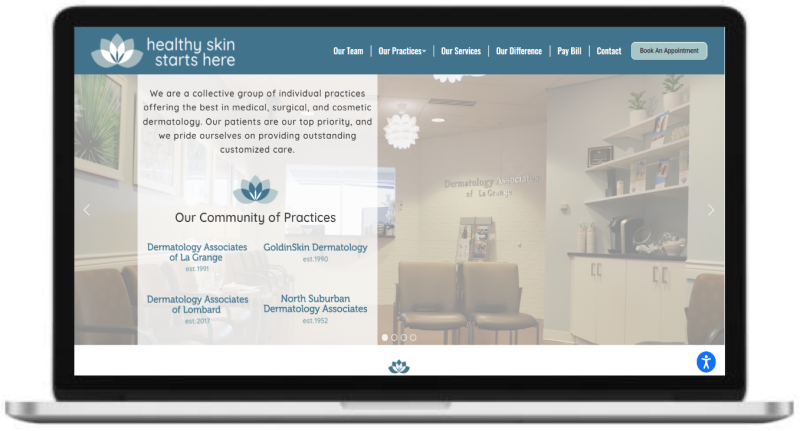
Our main job was to deliver new and improved brand guidelines, including a new company identity, refreshed icon and tagline, and new logos, colors and fonts. We then incorporated these brand elements into a fully integrated website.
The Results
We achieved the aforementioned deliverables, and more. Throughout the process of refreshing the brand, we discovered that it was imperative to also also rename and redesign DAL into something meaningful, identifiable, and sustainable. Thus, SJH Derm was born – a physician driven & employee-owned organization. It is undoubtedly part of the brand story, along with the new visual brand elements.
SJH Derm Visual Elements


Icon
The new and improved lotus (bottom) is an evolution of the previous icons (top), which were inconsistent, outdated, and misaligned to the current brand.
Logos
Maintaining the client’s desire to honor the individual practices, we created fresh and consistent logos that highlight the lotus icon and stays true to the updated brand identity (top 4).
The new identity of SJH Derm needed a logo different from, but consistent with, the individual practice logos (bottom).


Website
- Page speed is 75% faster
- Reduced page size by 80%
- Implemented accessibility function
- Improved usability on mobile devices
- Trained marketing staff on website management
Testimonial
“The Brylson group was fantastic to work with! They truly became an extension of our team and delivered an exceptional brand and website to match our unique story and mission. They were professional, easy to work with, and kept the workflow on track. It is obvious that they have years of experience in brand strategy, creative, and website design. 10/10 recommend!“

